Highlights from the article:
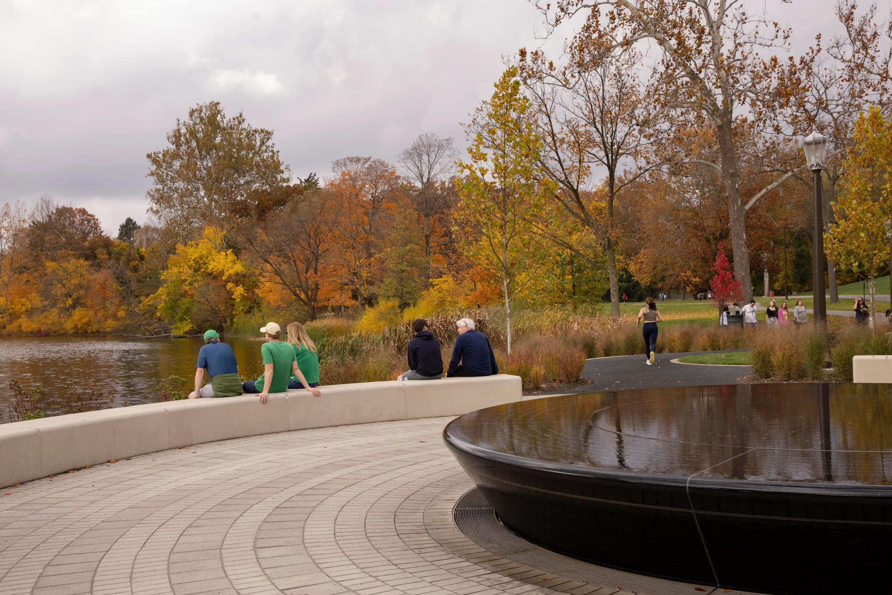
Black granite was chosen because it portrayed calmness and seemed to have the most contrast once it was etched with the prayers, according to Dayrell. "Sourcing was a challenge, particularly finding a solid-colored black granite without a heavy amount of veining," Dayrell says. The team analyzed granite from 14 quarries, reviewing details such as depth and size of etching, gold paint, finish, grout color, and grout finish options to ensure their design vision would be spot on. Materials were reviewed wet and dry to understand how they would respond underwater and when the fountain was turned off for the winter months.
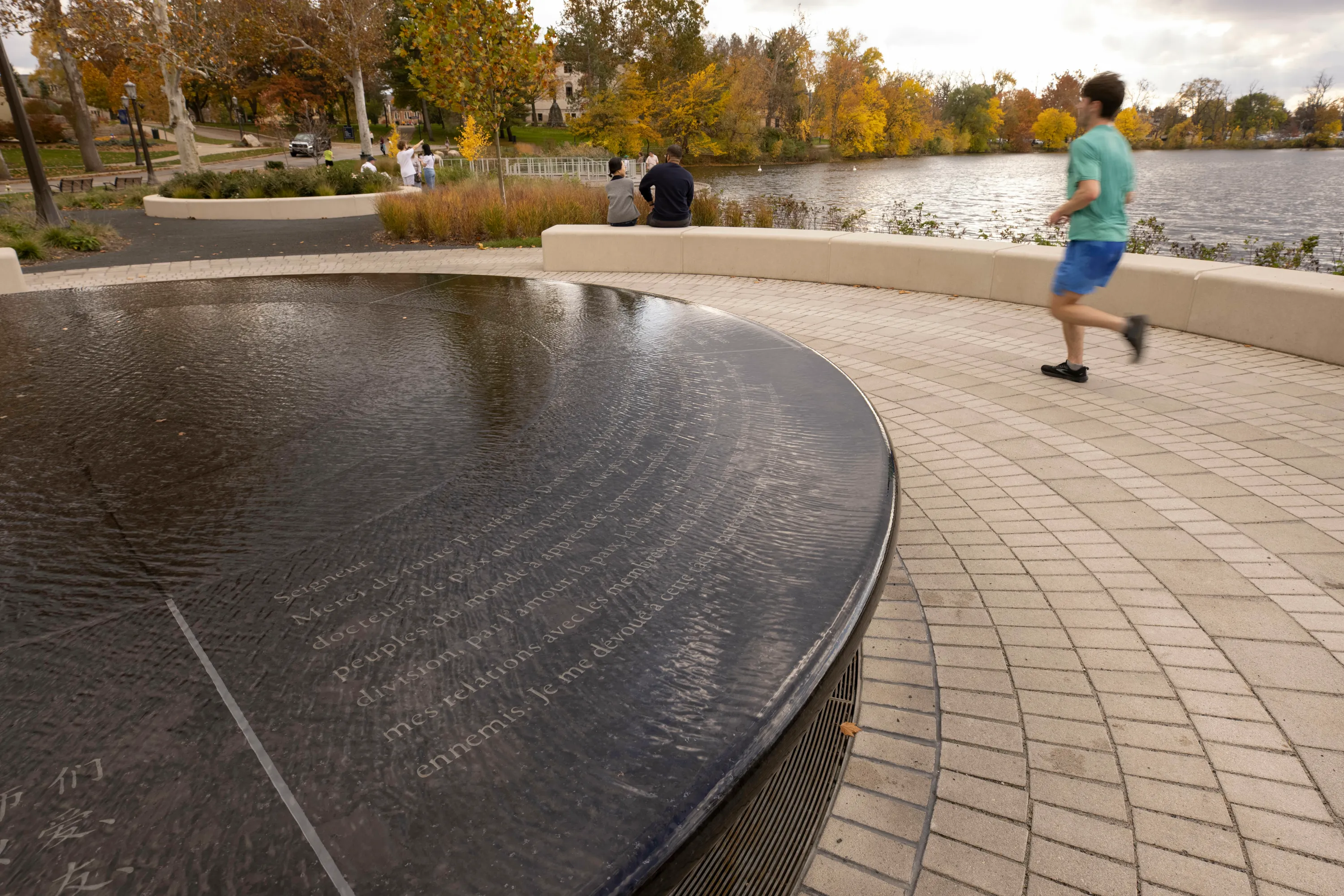
"The team centered around a dark granite because we saw it as having the most contrast once engraved with clear legibility from farther away," Dayrell says. "The black granite with the painted gold lettering really makes things pop." The monolithic black granite chosen has a subtle frostiness which helps elevate the water movement of the fountain, Dayrell adds.
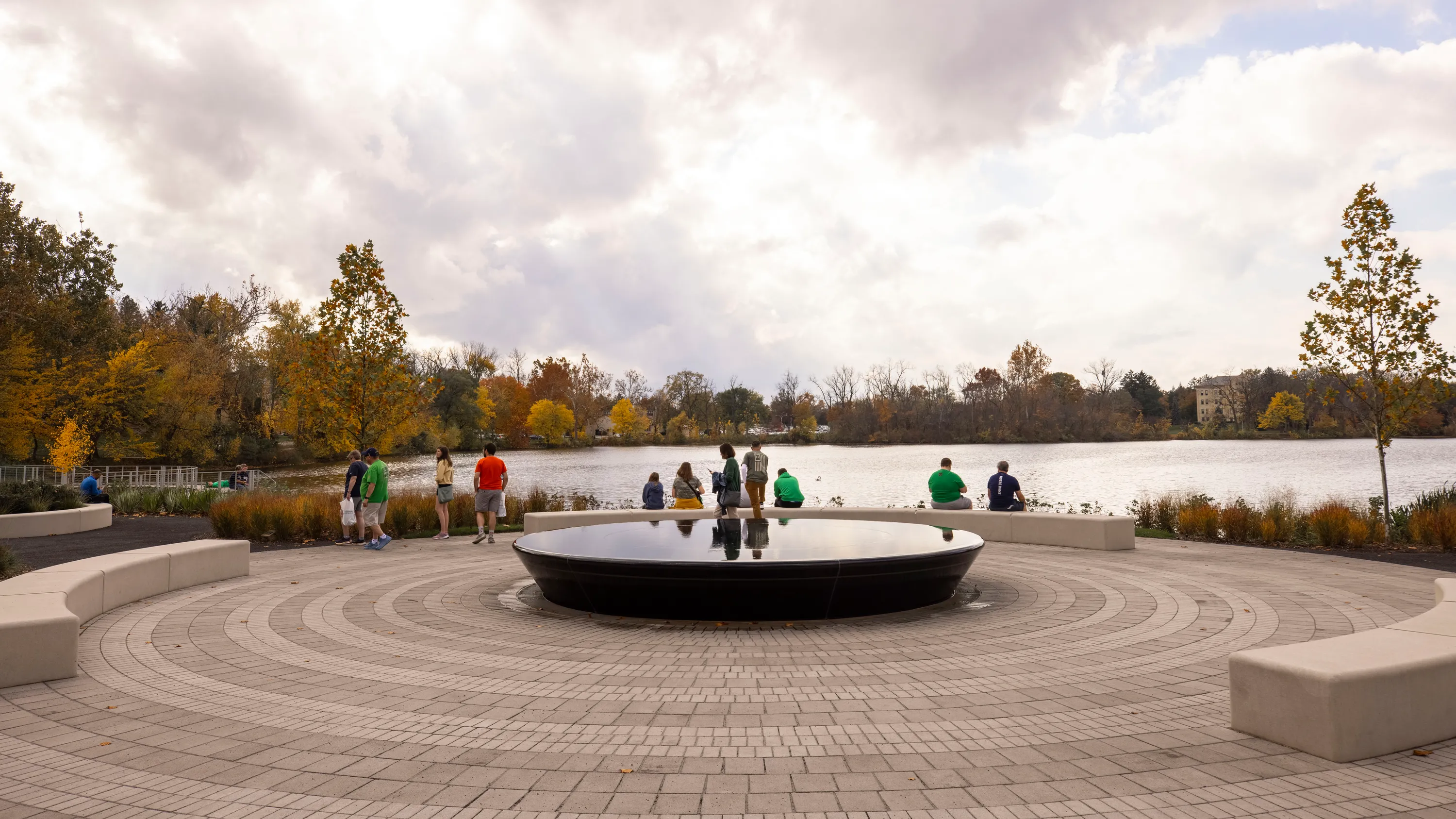
Erik discusses how the team worked with Murphy Marble to ensure they had a plan to minimize joint patterns and keep the pieces properly pinned in place to prevent future movement. The team also worked with fountain design firm Fluidity, who helped guide the design of the fountain to assure water would slip over the edge with creating a waterfall effect and planned out the internal mechanical systems.
The prayer lettering was handled carefully, as the team had to work with a manufacturer to create a template for the six sections of the fountain that feature the prayer. Taking it a step further, the prayers were reviewed by Notre Dame's language scholars to ensure accurate translation, according to Dayrell.
Go to https://www.naturalstoneinstitute.org/resources/building-stone-magazine/ to check out post publications from the magazine!
